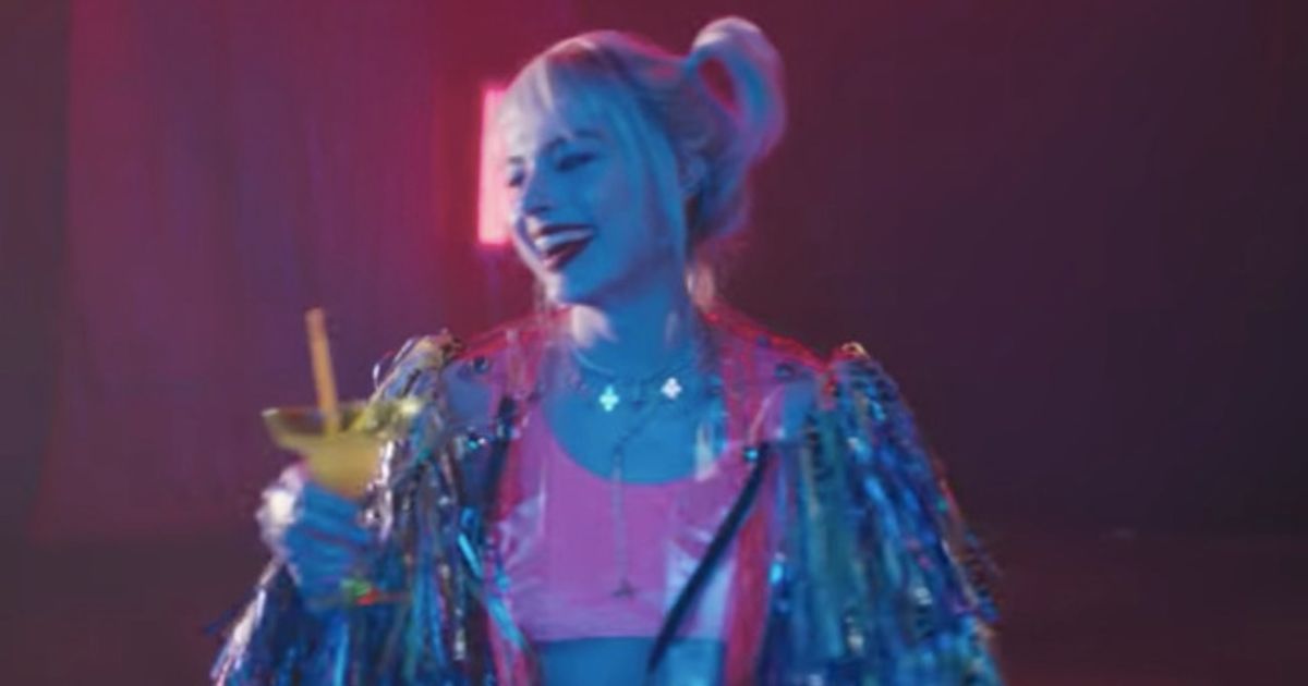
Birds of Prey (and the Fantabulous Emancipation of One Harley Quinn) has finally wrapped up filming and fans are pretty hyped to see it. The movie is looking to be an interesting DCEU film in the post-Snyder era where Warner Bros is hoping to make their DC installments more fun and entertaining. Well, we now know what the logo looks like and, honestly, it actually stands out when compared to other superhero titles.
As fans can see, the logo actually has a lot of personality, though it's clearly focused more on Harley Quinn than the group. Having the ridiculously long subtitle written in pink and being put in the side is a nice touch, though it might remind Square Enix fans of The Bouncer for some reason. Still, it looks more interesting than the logo of, say, Batman V Superman.
That being said, it's still a logo and we're gonna have to wait and see how a future trailer will look like. With Margot Robbie producing, she may have more creative control than most and we're hoping it's more than just a Harley Quinn showcase. At the least, judging from that one 20-second trailer, it could be a colorful and fun movie.
Birds of Prey (and the Fantabulous Emancipation of One Harley Quinn) comes out on February 7, 2020.
Read: Birds of Prey Wraps Production, New Harley Quinn Photo Released
Explore new topics and discover content that's right for you!
DC


